The context
8 in 10 shopping journeys start with a search. Built for the mass-market majority, the experience often feels generic-even when customers search for a specific brand. The opportunity was to create a differentiated, brand-led shopping experience that helps customers explore what the brand has to offer.
Understanding the problem
Quantitative research
I reviewed search performance data to understand how branded searches compared with unbranded searches.:
Nearly 1 in 4 Amazon searches include a brand name, yet broad branded searches showed:

23% searches
include brand name
2.37 percentage points
higher abandonment

0.67 percentage points
lower purchase rate
Conclusion: When a customer types a brand name, they are more likely to leave without buying. This gap prompted me to review existing research to understand where the experience fell short.
Qualitative research
I reviewed multiple existing customer research studies for search and branded space and identified three key customer pain points :
2.1 Help me explore the brand’s range
Customers struggled to understand large selections and narrow their choices.
Anecdote: "There are so many different products, what am I really trying to get? So many results that it is hard to narrow down"
2.2 Help me feel confident in the brands I’m buying
Shoppers perceived Amazon as being overrun with unknown or low-quality brands, leading to a lack of trust when shopping for known brands.
2.3 Help me discover relevant brands
Shoppers open to new brands didn't know where to start looking, and Amazon's expansive selection complicates their task.
Unrelated suggestions made customers feel their preference had been ignored. Alternative brands needed a clear connection to what they were shopping for.
Anecdote: "The first big thing going on here is brand ‘baleaf’ and that is not Under Armour, that is not what I am searching for." - Participant searching "under armour women"
CURRENT CX
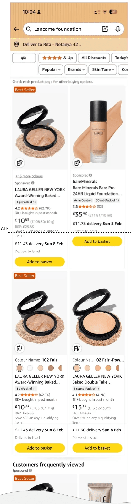
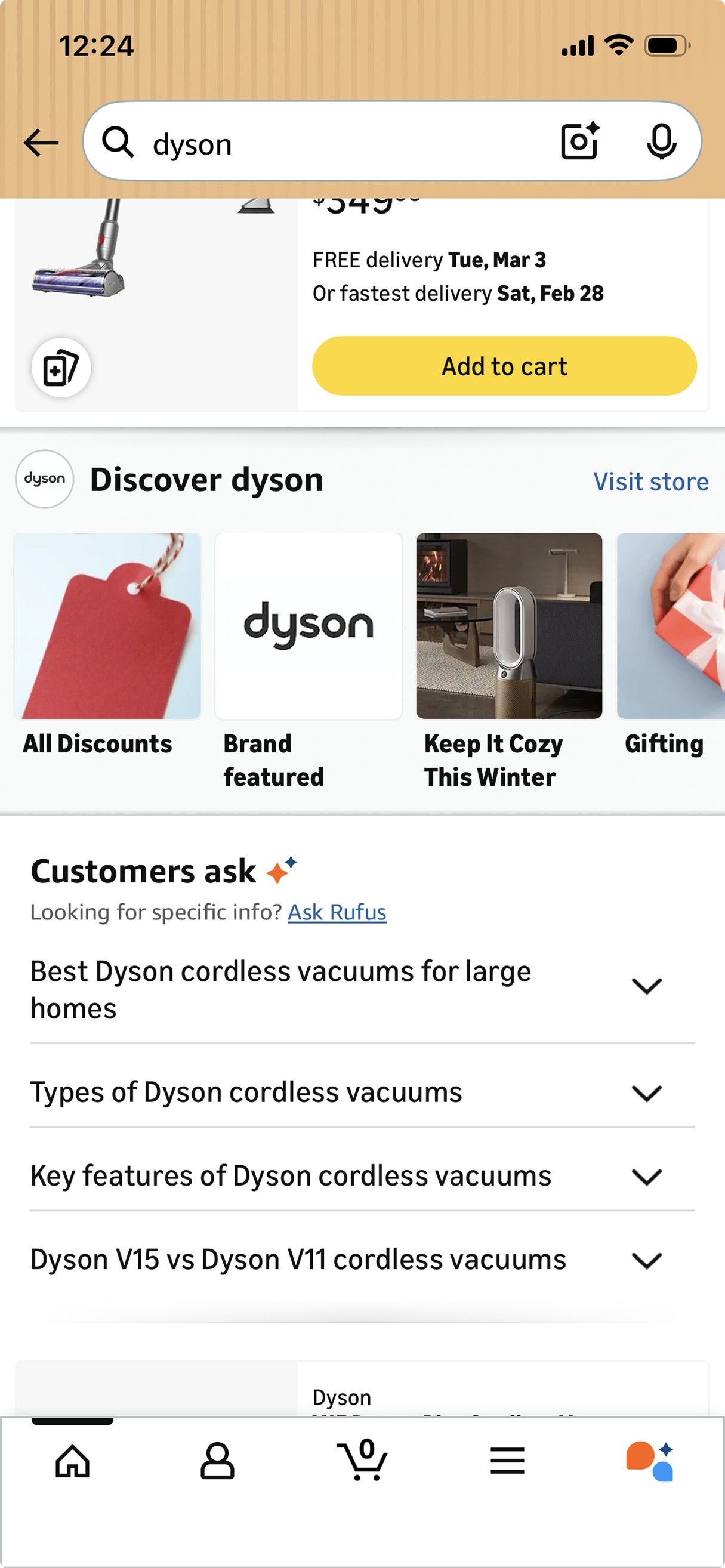
A brand-led query, a
generic search experience
Example queries: Lancome foundation, Dyson
01 Weak brand presence; weaker customer trust
Beyond the search query, few visual cues connect the page to Lancome, making its products harder to recognise and providing fewer signals of brand authenticity.
02 Searched brand isn't prioritised above the fold
Sponsored products and other brands occupy the initial viewport, requiring customers to scroll to find Lancôme products.
03 Limited guidance through the brand's range
Flat grid search results offer little structure for
understanding and exploring Lancôme’s range.
04 Alternatives without context
Other brands appeared prominently, without a clear explanation of their relevance to the customer’s search.
05 Small collection tiles; limited visibility (BCT 1.0)
Compact tiles gave collection imagery little space, making
the browsing route easy to overlook within search results.
Design strategy
A broader direction, starting with the existing experience
The research and CX evaluation revealed an opportunity to improve the whole branded search journey—from exploring a brand’s range to discovering relevant alternatives. I started with improving an existing route for brand exploration as the first step towards that broader experience-
Brand Collection Tiles.
Phase 1: Improve the existing branded components- BCT redesign (BCT 2.0 ready for launch and BCT 3.0 in progress )
Phase 2: Expand the branded experience- Brand Logo Tiles and stronger brand presence across search(currently under developement)
A closer look at Brand Collection Tiles (BCT 1.0)
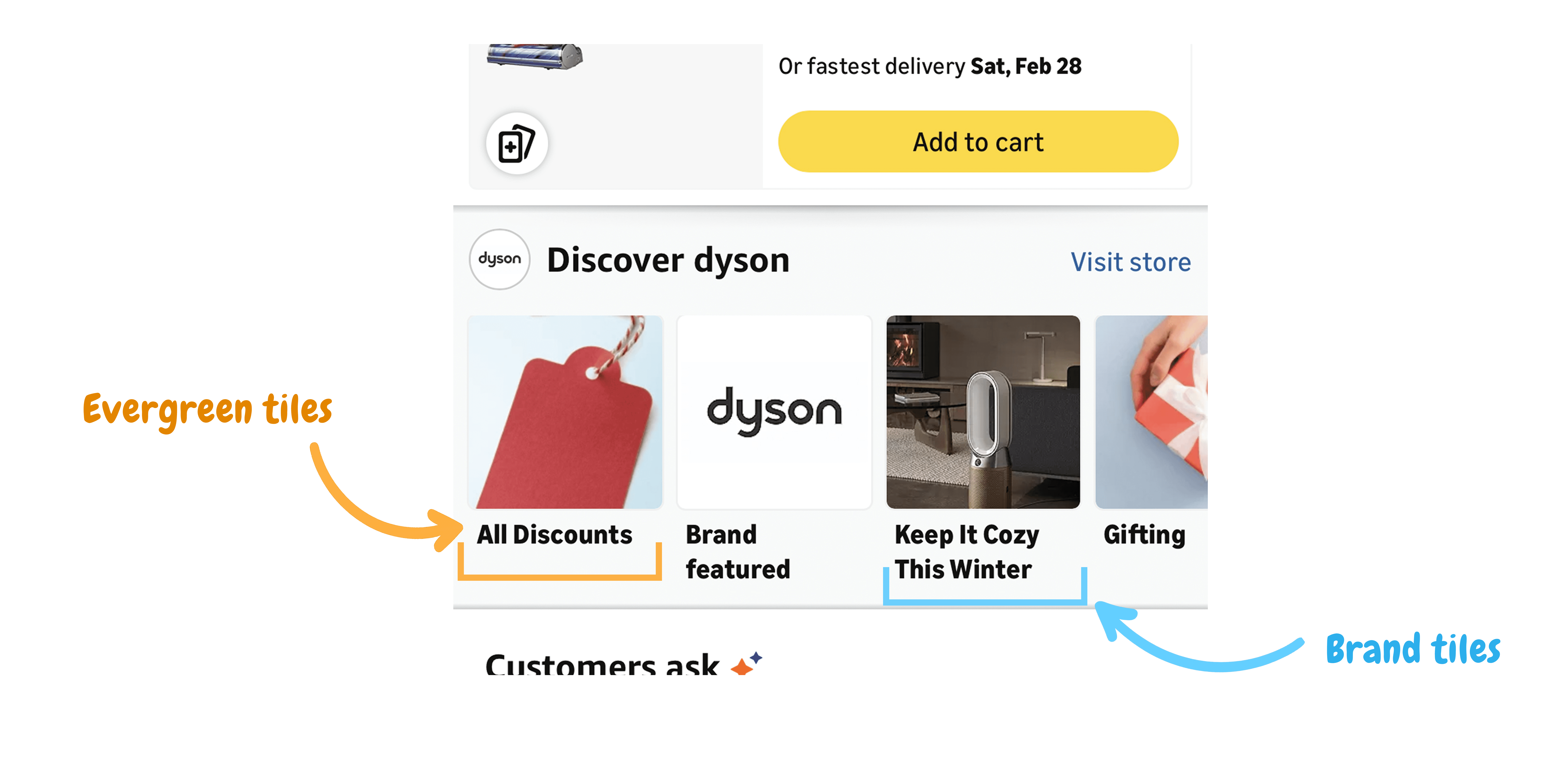
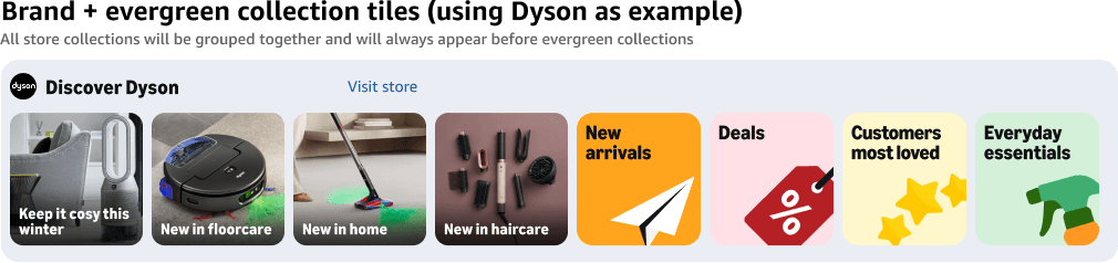
Evergreen tiles are Amazon curated that offer familiar shopping shortcuts; branded collections feature content from the brand store provided by the brand.
Following my evaluation of the search page, I reviewed existing BCT usability studies to understand how customers noticed, interpreted and used the tiles.
Customers overlooked the BCT widget
BCT appeared in 18 searches but no participant clicked BCT without prompting.
- Moderated usability testing done on live weblab version - Report published Mar 2025
Anecdote: "I think I scrolled past it, it blends in. The section is a little small"
Evergreen tiles' imagery lacked relevance
6 of 7 participants felt visuals did not adequately represent the collection and found them underwhelming.
- Unmoderated usability testing done on Figma prototypes - July 2024
Anecdote: "The customer's most loved should have hearts and not just pants"
Tiles names lacked clarity
4 of 7 participants found the names too generic
- Unmoderated usability testing done on Figma prototypes - July 2024
Anecdote: "[Most loved] What does this mean? Most loved by whom?"
Together, these findings gave me a clear reason to redesign BCT- the browsing route existed, but customers struggled to notice it and understand its value.
BCT 2.0 - approved for launch
Redesigning Brand Collection Tiles
Example query: Dyson, Lancome
Making BCT more visible
"I think I scrolled past it, it blends in. The section is a little small"
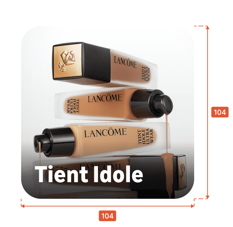
1.1 Refined sizing to balance visibility and browsing
I increased the base tile size from 100 × 100px to 104 × 104px to give images and labels more room. The tiles adapt to different screen sizes, keeping part of the next tile visible to encourage swiping.
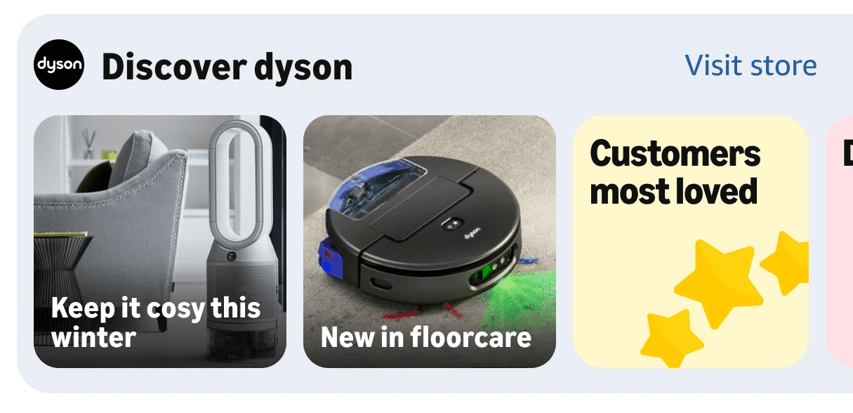
1.2 A distinct container to make the widget stand out
I grouped the brand header and tiles within a tinted, rounded container to break the visual monotony of search results and draw attention to the widget.
Making collections easier to understand
"The customer's most loved should have hearts and not just pants"
"[Most loved]What does this mean? Most loved by whom?"
2.1 Distinct imagery; a consistent tile system
I used lifestyle photography to bring brand expression to branded tiles and updated evergreen imagery with approved Amazon illustrations, responding to the feedback that the visuals felt irrelevant and underwhelming.
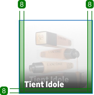
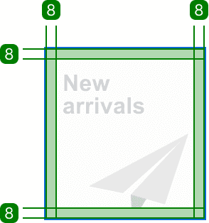
Shared styling unified both tile types:
104 × 104px at a 375px viewport; scales with screen width
Bold Ember Modern Text, left-aligned, sentence case
12px corners and 8px padding
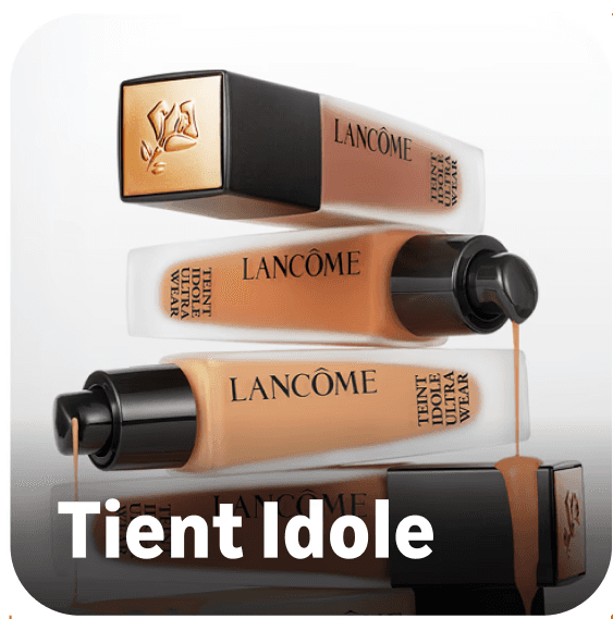

2.2 Stronger labels to make collections easier to scan
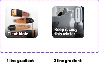
I moved labels inside the tiles, using bold, sentence-case. White text on shaded imagery and dark text on solid backgrounds supported readability. Longer branded collection names wrap onto two lines.
2.3 Clearer naming for evergreen tiles
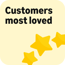
Based on customer feedback, I renamed "Most loved” to “Customers most loved" and "Internet famous” to “Influencer favorites" to clarify whose preferences each collection reflects.

3. Ordering collections to reflect brand intent
I placed branded collections first to respect shoppers’ brand preference and help them discover and explore the brand's range.
Designing across screens, text sizes and languages
4.1 Keeping collections browsable across screens
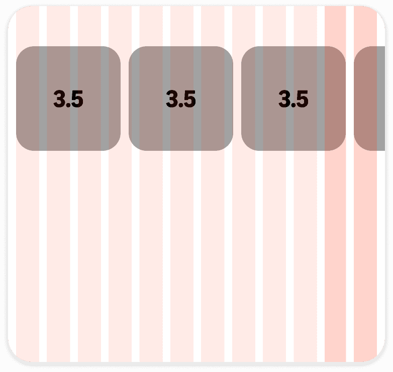
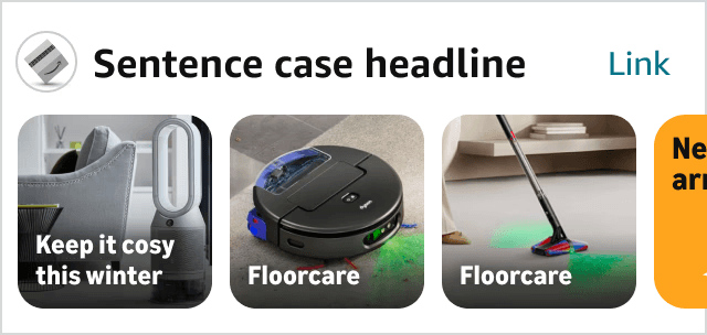
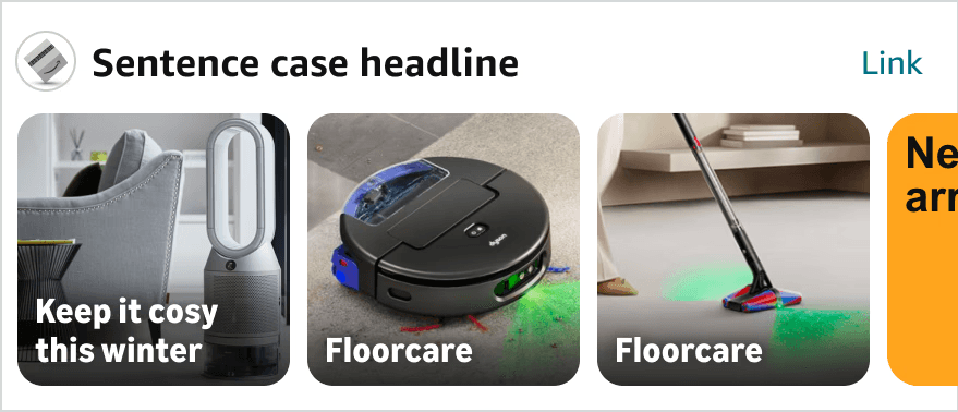
I sized tiles proportionally to the viewport, with each spanning 3.5 columns
of a 12-column grid. Text also scales with screen size to maintain its proportion
within the tiles, while roughly three tiles and part of the next remain visible
at the default text setting.
320 px screen
440 px screen
4.2 Making room for larger text
To meet Amazon’s accessibility requirement to support 200% text size, I allowed tiles to grow with their labels. This prioritised readability, accepting fewer visible collections and a taller component.
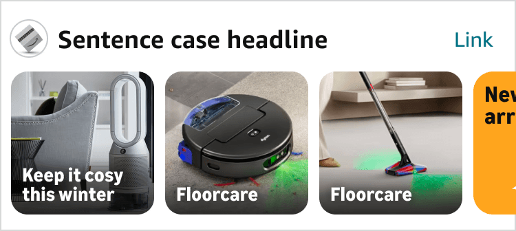
Default text - 100%
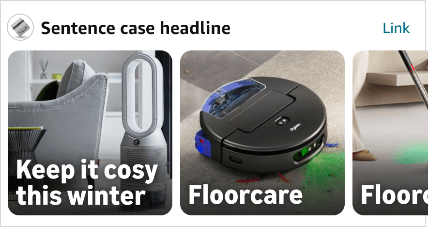
Larger text- 200%
4.3 Accommodating longer evergreen translations
I explored evergreen labels across 11 languages to support launch in 10 European countries. For titles spanning three lines or containing a single long word, I allowed tiles to widen by up to 8px without increasing their height.
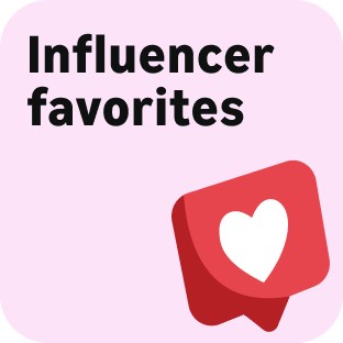
English
104 px wide
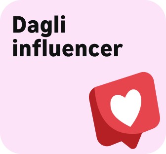
Italian
112 px wide
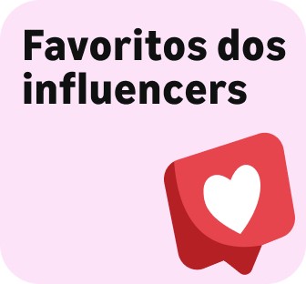
Portuguese
112 px wide
The redesigned experience in context
A distinct container, clearer imagery and labels, and branded-first ordering bring the collection experience together within search.
BCT 1.0
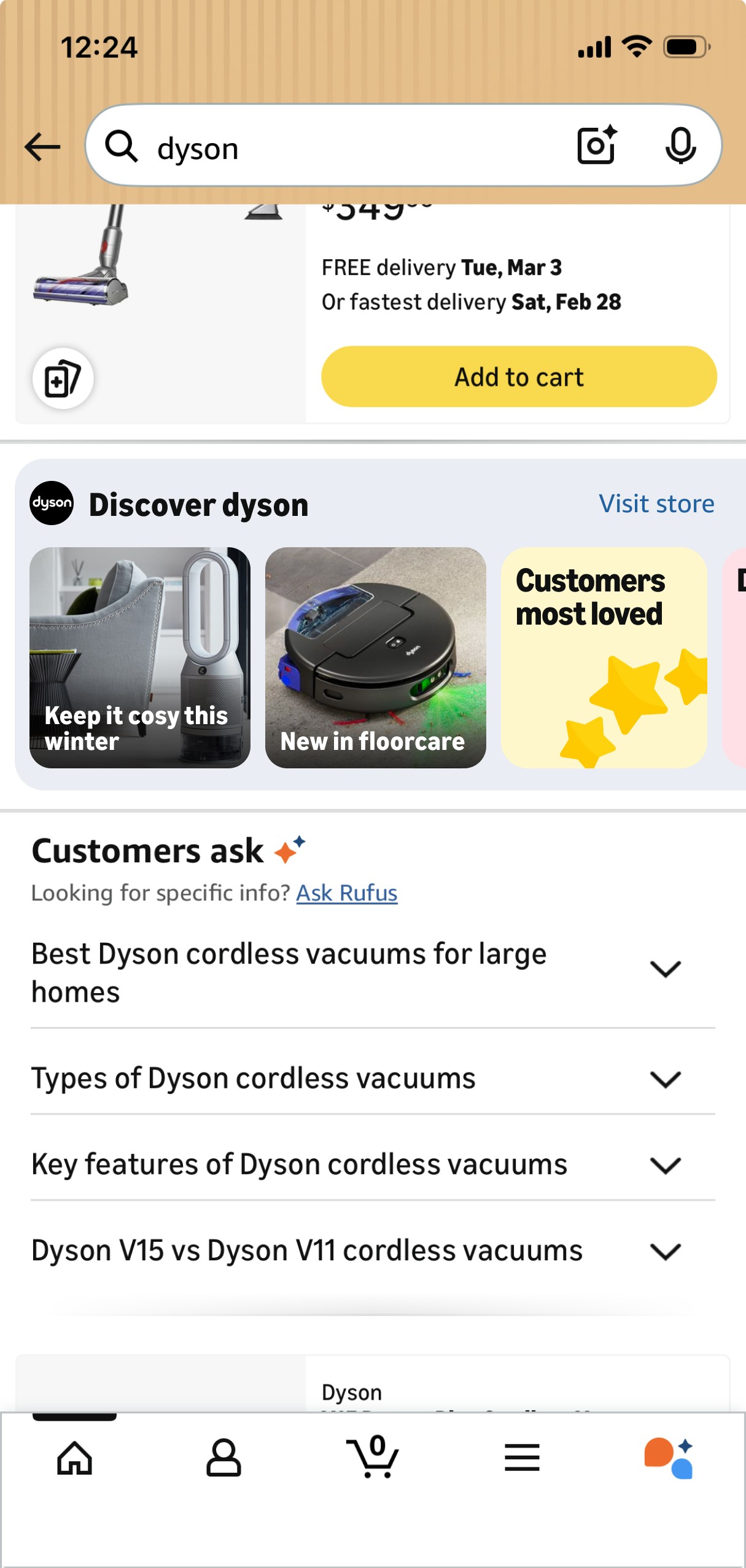
BCT 2.0
Exploring alternative tile formats
I explored different tile sizes, proportions and imagery treatments to balance collection visibility with space for product results.
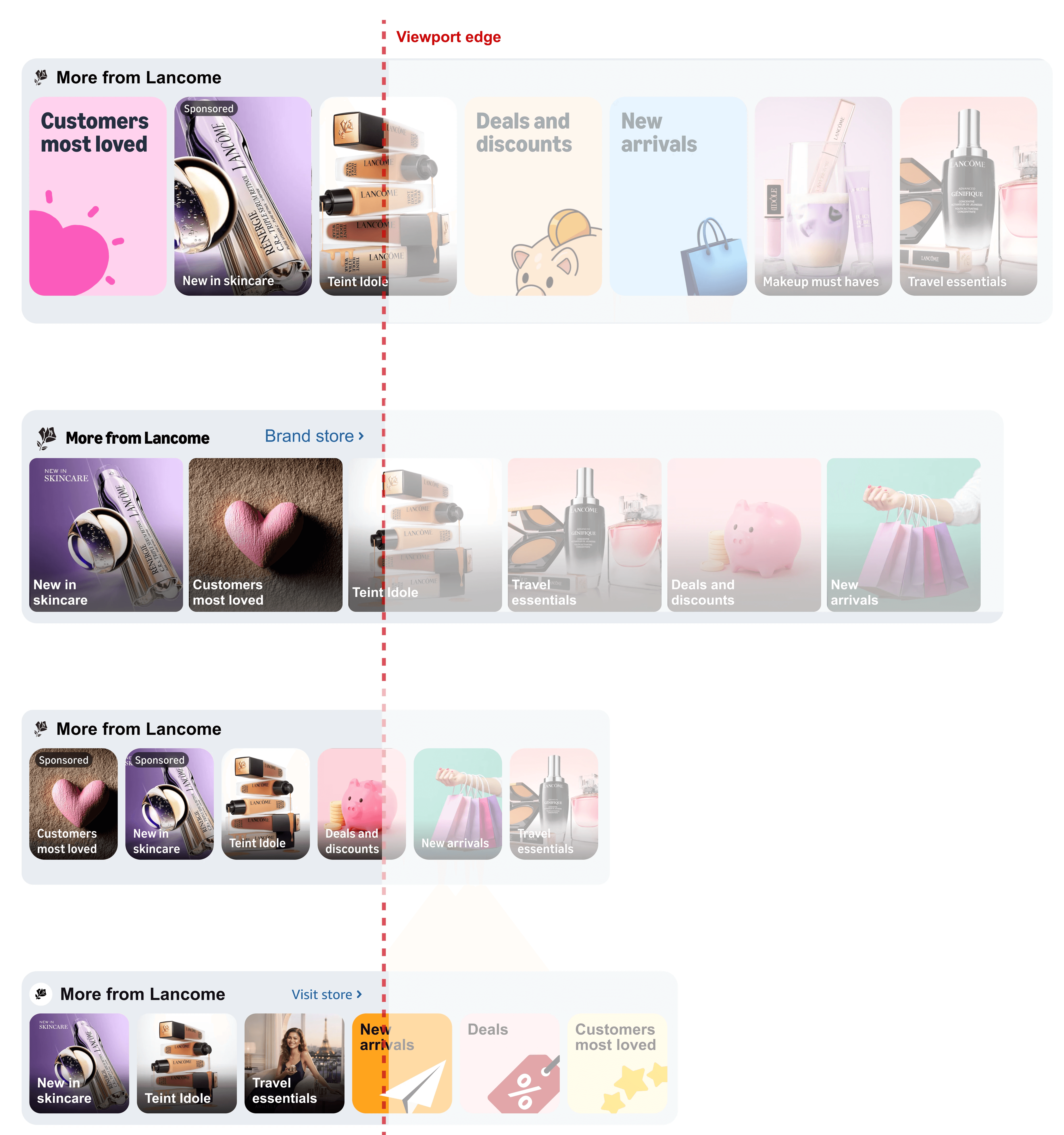
Option 1 -> 143px x 207px
Tall tiles
More room for imagery, but the added height pushed product results further down.
Option 2 -> 160px x 160px
Large square tiles
Less height than the tall format, but only around two collections and part of the next were visible.
Option 3 -> 92px x 116px
Uniform imagery
A consistent image-led treatment offered fewer visual cues to distinguish evergreen from branded collections.
Selected direction-> 104px x 104px
Compact square tiles
More collections visible than the larger formats, while preserving space for product results and distinguishing each collection type through imagery.
BCT 2.0: Results and learnings
A four-week experiment with approximately 32 million customers across the US and EU5
Estimated impact

+$47.3M/year
long term revenue
+917K
additional units
+17.1M
US revenue

+0.15%
Italy search revenue
What still needs improvement?
The click through rate (CTR) remained unchanged
Conclusion
BCT 2.0 brought a more consistent, accessible collection experience to a broader set of branded searches. Earlier research and latest performance metrics prompted me to focus on the relevance of collections that better reflect how customers shop for brands.
BCT 3.0 - ready for testing
AI powered Brand Collection Tiles
Example query: Coach
I proposed AI-generated collections that reflect how customers shop within a brand, pairing recognisable product lines with clear
product previews and dedicated collection pages.
How AI collections work
AI uses the search query and product information to group items from a brand’s catalogue, generate collection titles and create
landing pages. Collections update as the catalogue changes, reducing reliance on manual curation.
1. More specific ways to explore the brand
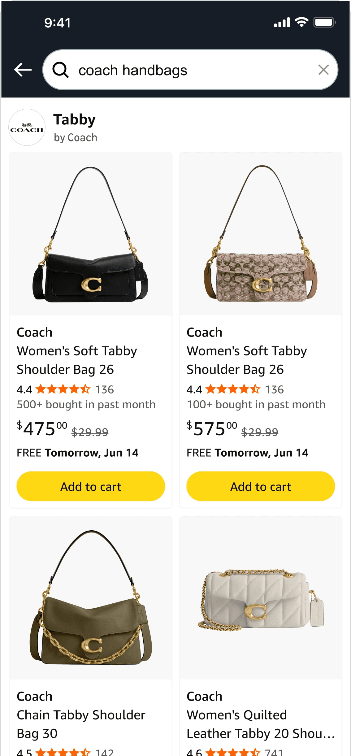
Product-line collections give shoppers a clearer starting point to explore the brand’s range and narrow their choices beyond general shortcuts such as deals or customer favourites. For example, “Coach handbags” surfaces handbag collections rather than unrelated categories
2. Clearer previews of what’s inside
Although product imagery was least noticed in an earlier imagery study, 10 of 15 participants preferred it in a direct comparison. I chose it here because it represents specific product lines, pairing relevant visuals with clear collection titles to show shoppers what to expect before they click. Using relevant brand product images maintains the brand expression and relevance.
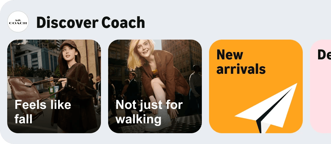
BCT 2.0:Lifestyle imagery and thematic collection names
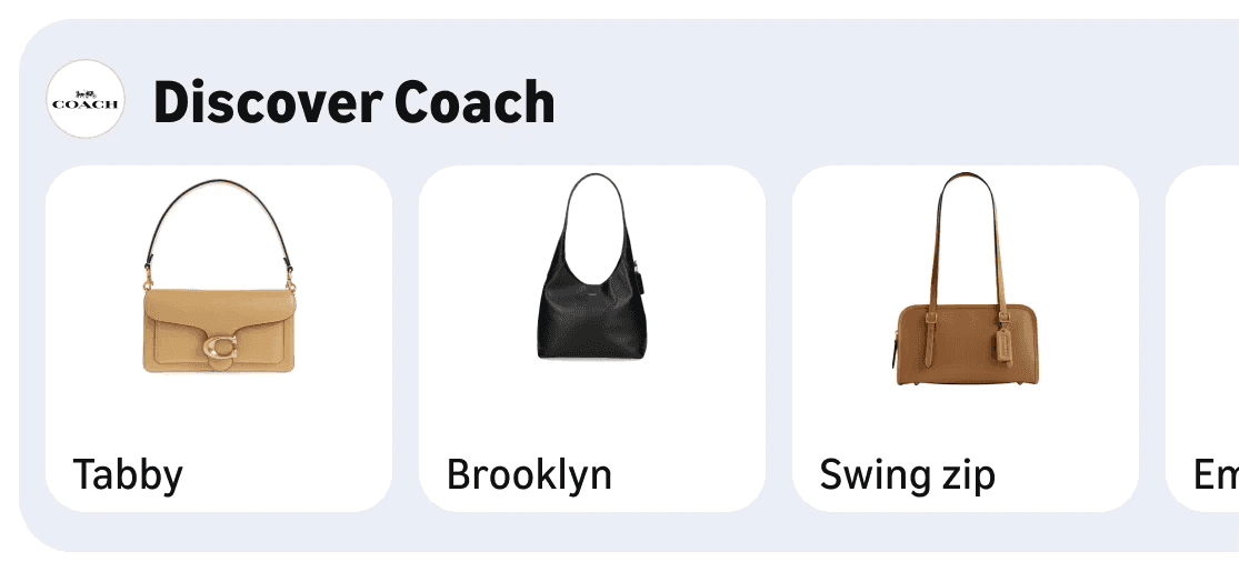
BCT 3.0: Product previews and recognisable product-line names
3. A connected post click journey
A collection-specific page carries the selected name and brand identity into the product results keeping customers in context. Other collections remain available below, helping them continue exploring the brand without returning to their original search.
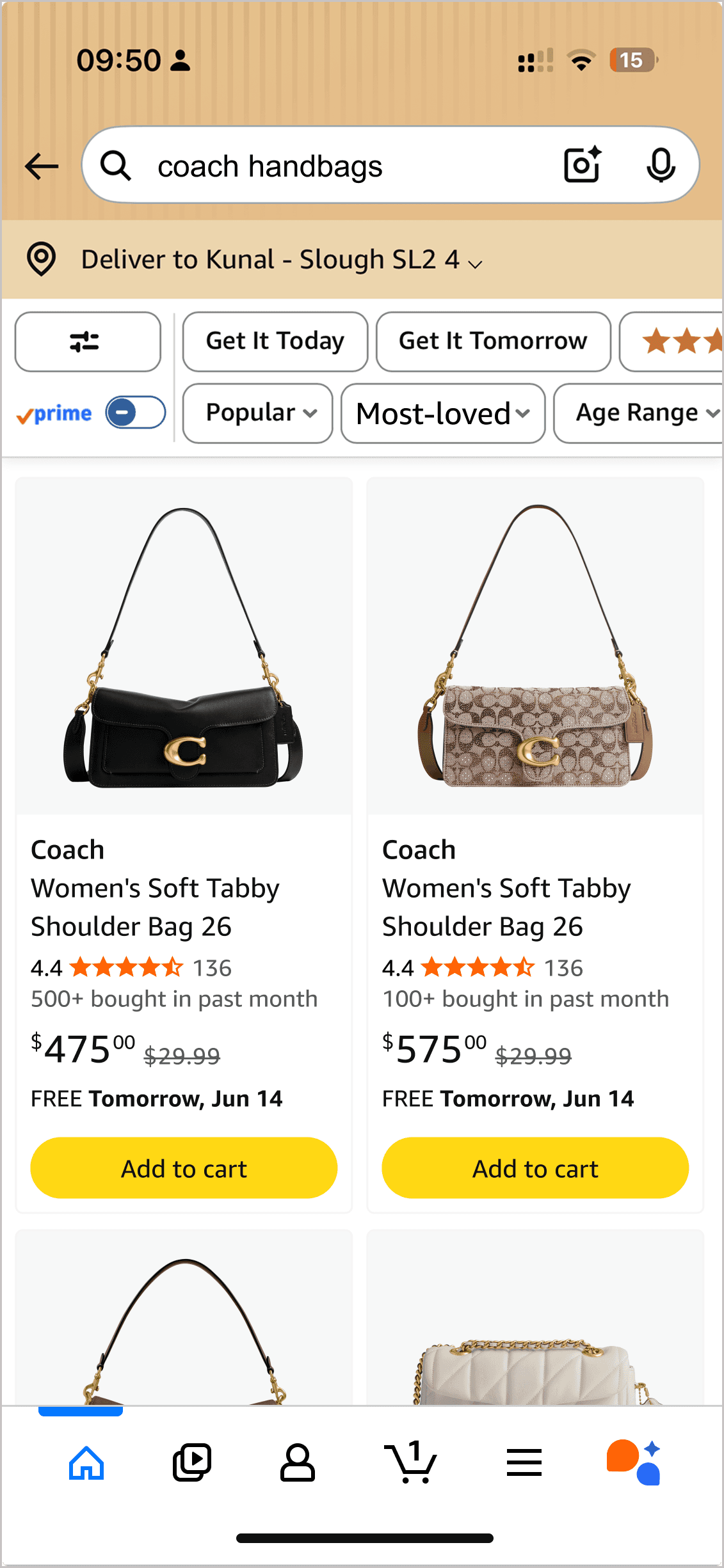
Before: Filtered search results
After: -Dedicated page with collection and brand context
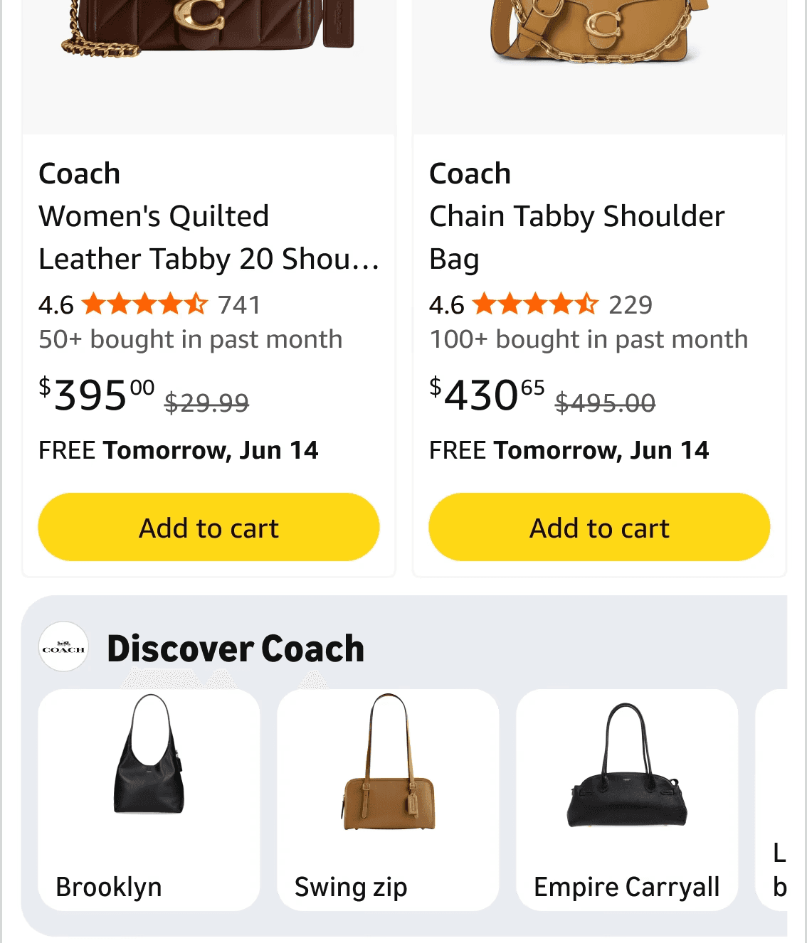
After: Continue exploring other collections
Currently being experimented
Brand Logo Tiles
Helping shoppers discover relevant alternatives
“Shoppers open to new brands didn't know where to start looking, and Amazon's expansive selection complicated their task and led them away from Amazon.”
Finding from earlier customer research
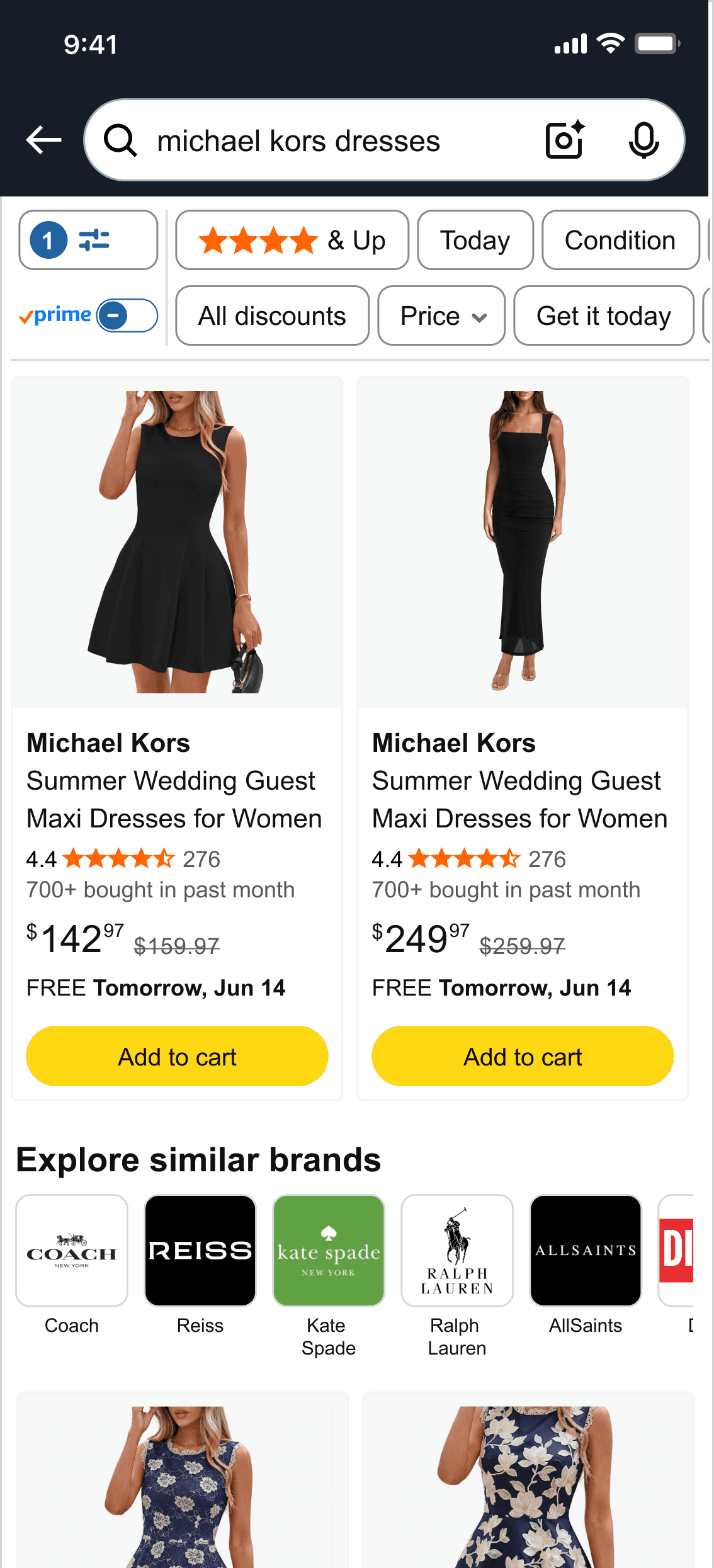
While BCT helped shoppers explore within a brand, Brand Logo Tiles offered a route to discover relevant alternatives. For a search such as “Michael Kors dresses”, the direction aimed to support discovery while respecting the shopper’s original brand preference.
01 Alternatives connected to the search
This direction presented shoppers with brands relevant to the searched category and brand, giving them related alternatives to consider.
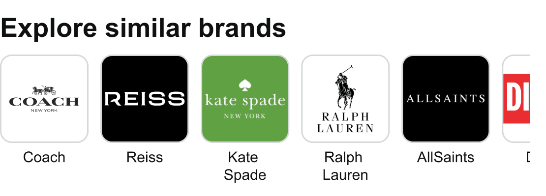
02 Recognisable brands at a glance
Logos paired with brand names helped shoppers identify familiar alternatives and find other brands to explore.
03 An optional route to explore
The compact brand logo tiles widget breaks the visual monotony of the search results, drawing attention to an optional way to explore similar brands.
Vision
Beyond the tiles: A vision for branded search
Example query: Lancome
“Shopping for an expensive bag feels no different from buying a kitchen roll.” - Anecdote from a customer
As part of the long term vision, I explored how brand identity, relevant content and social proof could make search feel more connected to the brand customers came for. This view highlights the branded components proposed for elevation. These would sit alongside organic results and other widgets, with their placement determined by search’s dynamic ranking.
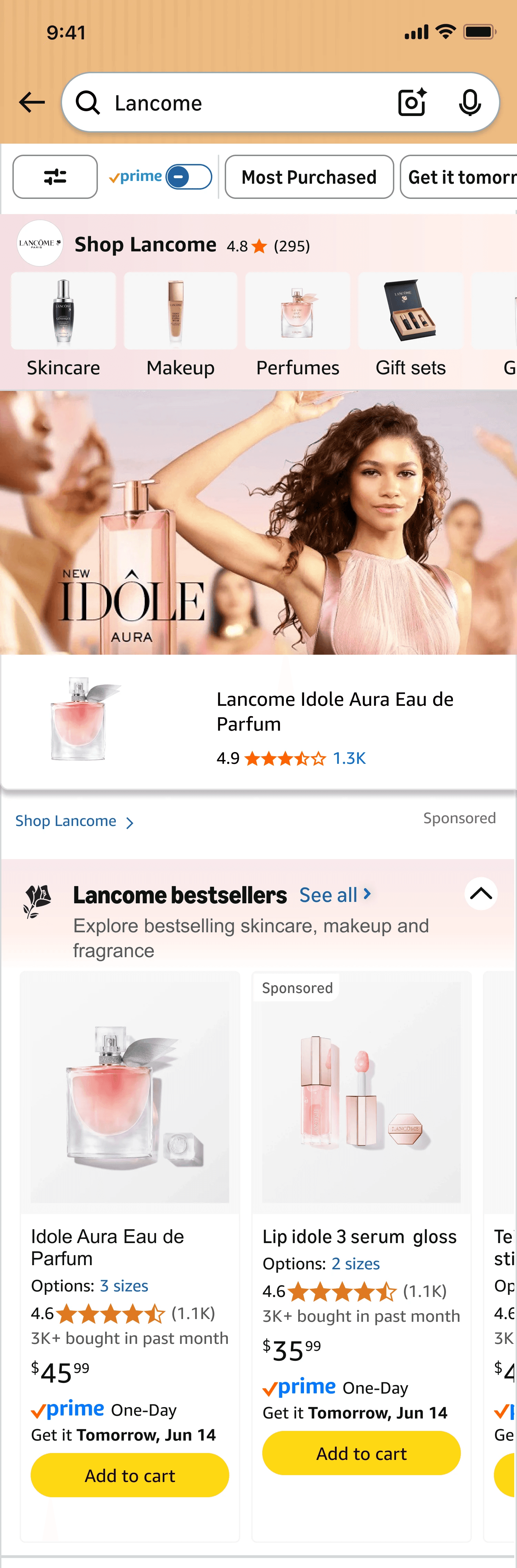
Bring the brand's identity forward
I used the brand’s logo and colours to create a recognisable branded experience, support a sense of authenticity and trust, and help shoppers distinguish the searched brand’s content from other results.
01 Brand-specific categories and social proof
Branded Lay of the land tiles (LOTL) reflect the brand’s own range, with brand colour reinforcing that context.
I also explored an aggregate rating across its products to surface social proof and support shopper confidence.
02 Feature the searched brand
Earlier research showed that unrelated ads frustrated shoppers who searched for a specific brand. Where available, I proposed featuring an ad from the searched brand or another relevant brand, keeping sponsored ad content aligned with their interest.
03 A clearer starting point for shoppers
“There are so many different products, what am I really trying to get? So many results that it is hard to narrow down.”
A dedicated bestsellers group (thematic search results;TSR) offered a starting point for shoppers overwhelmed by the selection, helping them begin with popular products from the brand.
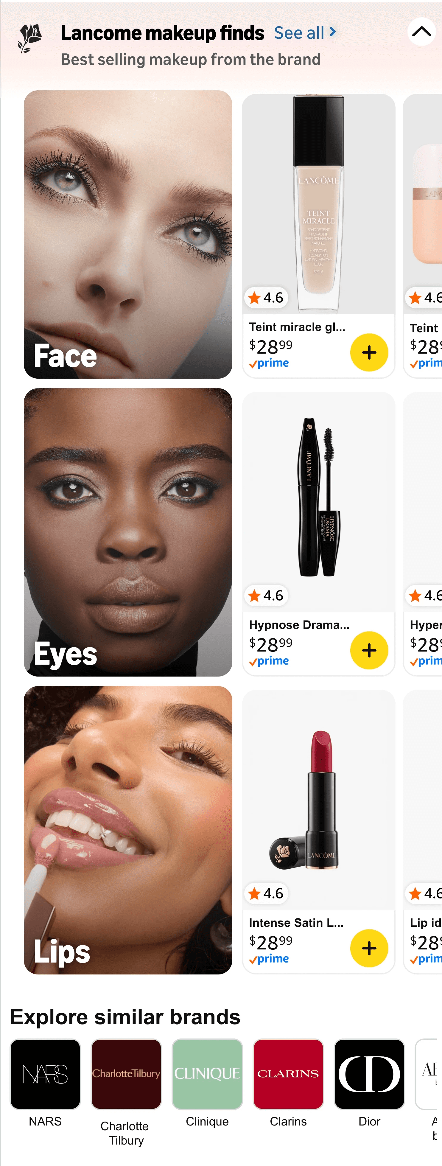
Exploration and discovery
04 Reflect how customers naturally shop
Grouping results into categories that reflect how customers shop within each brand. Brand imagery, logos and colours make these groups easier to recognise and give the experience a more distinctive, branded feel.
05 Discover relavant alternatives
Brand Logo Tiles offer an optional route to explore similar brands connected to the shopper’s search. Recognisable logos and clear names help shoppers identify alternatives, while a dedicated widget distinguish them from other searched results.
06 Content adapts to the query
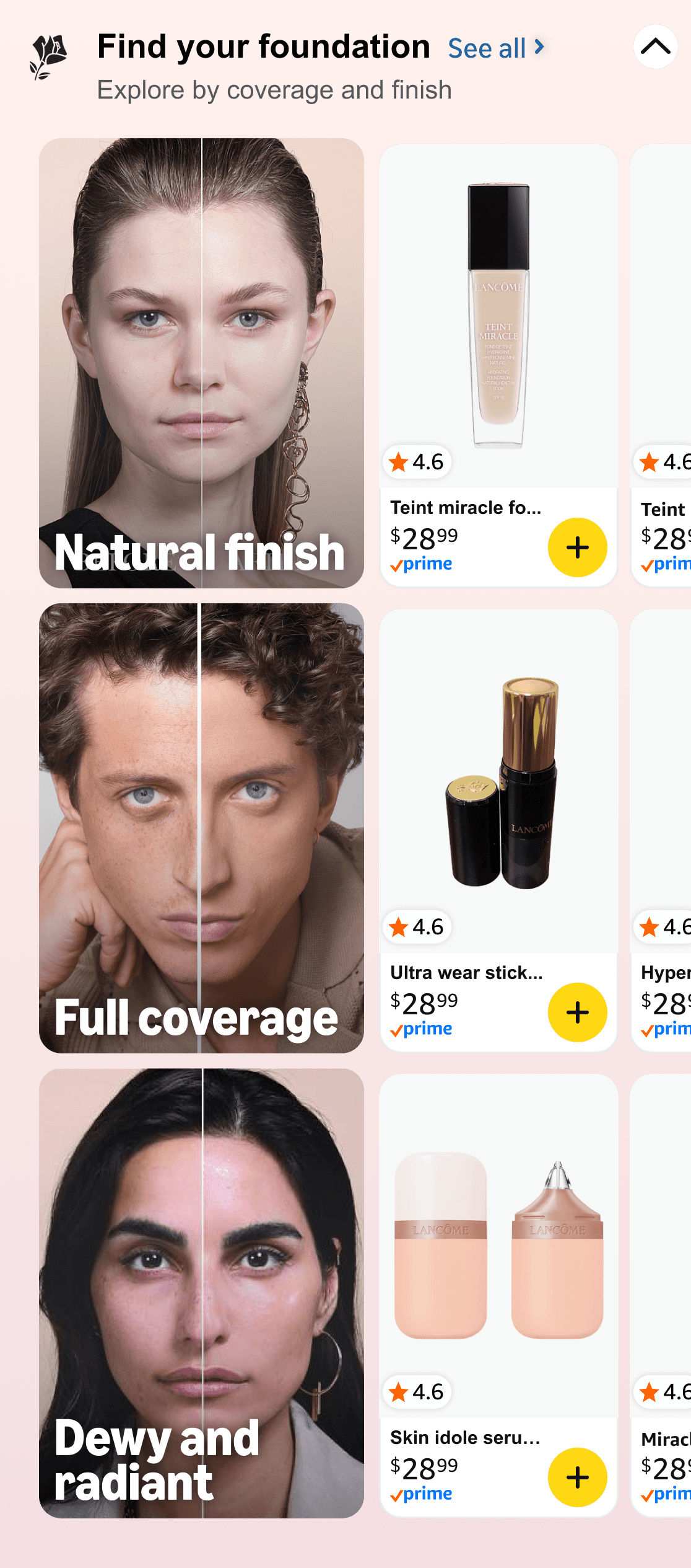
Content adapts to the search query to reflect how customers naturally shop. A broad 'brand name' query would support exploration across its range, while a 'brand+product type' query “Lancôme foundation” would offer more focused choices by coverage and finish.
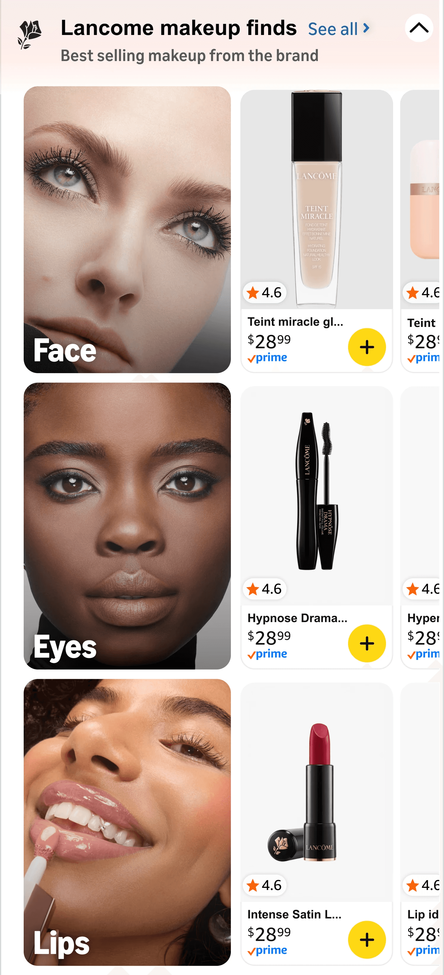
Lancome
Lancome foundation

What I learned
01 A visual redesign alone may not increase engagement. BCT 2.0’s unchanged CTR pushed me to examine what the collections offered shoppers.
02 Different searches need different guidance.
“Lancôme” invites exploration; “Lancôme foundation” calls for choices by coverage and finish.
03 Small details determine whether a design scales.
Longer translations and larger text needed flexibility built into the tiles.